top of page
Sparrow Wine Website Redesign
Project Overview
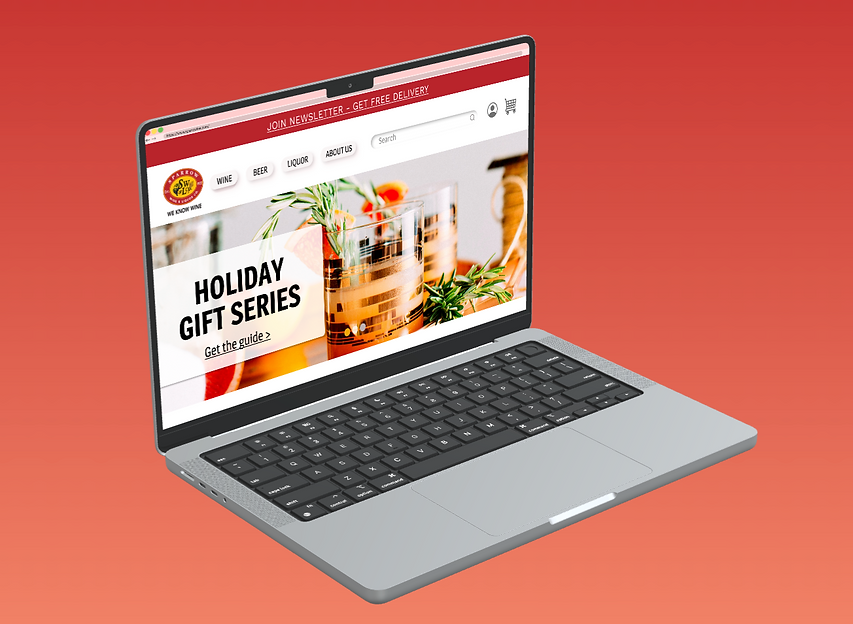
Sparrow Wine & Liquor Co., a well known liquor store located in Hoboken, New Jersey, needed a full website redesign to help drive up delivery sales. They wanted the new website to be more user friendly and include an easier check out process.
Role
Scope
UX Researcher,
Copy Writer, Interaction Designer,
Content Strategist,
UI Designer
2 week Sprint

Sparrow Wine & Liquor Co. is one of the leading and most respected wine and spirit merchants in New Jersey.
Project Summary
In this project, I had two weeks and worked with a $0 budget to come up with a new user interface for the e-commerce website. Keeping in mind that the ultimate goal of the company was to drive up delivery sales, I organized interviews to learn more about what the users were experiencing.
In these contextual interviews, I learned what pain points users were experiencing from the website. From there I went into a competitive & comparative analysis to see how Sparrow wine & Liquor compared to their competitors. This led me to my idea for the new UI design and I started sketching. Overall, the redesign was a success among users who tested the prototype who left with a pleasant experience.
My Contributions
I was responsible for this project from start to finish. This included doing research, defining the problem and creating a persona, creating flowcharts and wireframes as well as designing a finished user interface prototype.
Methods used
Research • Card Sorting • Wireframes User Interface • Prototyping Usability Testing
User Research
Goals
-
Learn more what the users thoughts are when browsing through the client's website
-
Find out how users think and categorized elements through card sorting
-
Discover what features users most use when shopping online
-
Define our new layout based on user's needs and wants
Anchor 1
Results
-
Majority of users want to see real people wearing the clothing so that they know how the clothing item will look on them and hopefully avoid the return process
-
Users expressed the sustainability of the brand plays an important role when shopping for activewear
Here are some comments on what users experienced when entering the website


Defining the problem
Users need to shop Sparrow Wine and Liquor’s website with a clear and easy navigation and to move through the checkout process smoothly. They want to avoid feeling overwhelmed with filters and busy visuals that deter them away from utilizing the site.
How Might We...
-
Create a better layout so users have a positive experience when visiting the website
-
Avoid the user feeling like the pages are too busy with information or visuals
-
Cut down on the filters to allow the user to focus in on their desired search

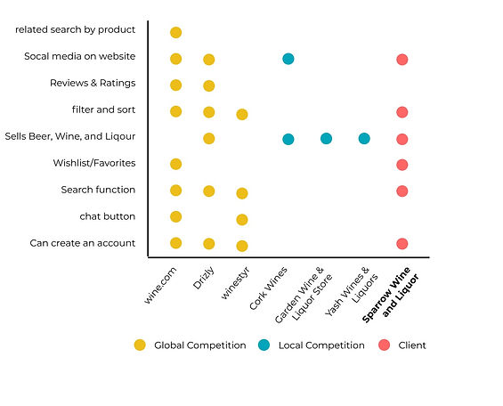
Comparative analysis
After comparing the features, Sparrow’s website is relatively not that far behind its competitors. They offer many useful features but the layout on how they offer those features are confusing and that's where they lose users. Understanding the layout of the other websites, we can better gage what users are drawn to and why, then take what we learn and incorporate it into the redesign of the website.
Anchor 2
Usability testing
Anchor 4
Task Senario:
You’re hosting your first dinner party with close friends later this week at your apartment. You want a nice bottle of red wine to accommodate the guest and the meal you are cooking. Since you work long hours and do not have time to go to the store you want the item delivered to your apartment.
Task:
Find bottle of California Cabernet Sauvignon that is in the $60-90 range, add it to your cart, and checkout.

Wireframes & Prototype
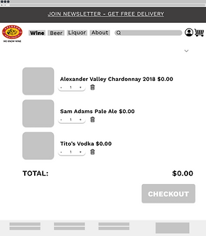
Low-Fidelity Wireframes
Anchor 3


Mid-Fidelity Wireframes


High-Fidelity Prototype

Anchor 5
Findings & next steps
After redesigning and testing the early-mid stages of the Sparrow Wine and Liquor website, users felt confident with searching for their desired item and going through the checkout process, stating that they felt it was a smooth and effortless experience. With this feedback, the new layout will ultimately attract more viewers and increase the delivery revenue for the company.
Next Steps
-
Clean up the layout of design
-
Further develop the global navigation and the account settings
-
Reevaluate the filters and adjust based on feedback
-
Go more in-depth on the High-Fidelity wireframes and prototype
bottom of page